Performance Gap Analysis
Freshdesk — Onboarding Flow Analysis
Social proof is present but positioned too late to reduce early hesitation
1.1 — The hero headline signals brand values, not user outcomes
Finding
The homepage headline "Customer service that puts people first" communicates a brand philosophy rather than a user outcome. A visitor evaluating whether to trial Freshdesk cannot determine from this headline what their support team will be able to do differently, how quickly they can get started, or what problem the product solves for them specifically.
Impact
Visitors who are not already searching for a customer service tool those arriving from content, referrals, or paid channels have no clear reason to continue reading. The headline does not confirm that this product is relevant to their situation. Bounce risk is highest at this point.
Recommendation
1.2 — The hero visual signals B2C, not B2B
Finding
The hero section features a chat conversation in which a customer asks "Where is my order?" a quintessential B2C e-commerce support query. The rest of the homepage, including testimonials from Bridgestone, Hobbycraft, and Total Expert, is positioned firmly as a B2B product. The hero visual contradicts this positioning and may cause B2B buyers such as support managers, operations leads, founders to question whether this product is built for their context.
Impact
A B2B buyer evaluating a support tool for their SaaS or services company sees an order tracking conversation and mentally files this as "for e-commerce." This creates a trust gap not because the product is wrong for them, but because the visual evidence suggests it isn't designed with them in mind.
Recommendation
1.3 — Social proof is strong but arrives too late in the journey
Finding
Freshdesk's homepage contains substantial social proof — four named testimonials with photos and company attribution, the "Trusted by 74,000+ businesses worldwide" claim, recognisable customer logos (Bridgestone, Klarna, S&P Global, Tata Digital), and G2 and TrustRadius recognition badges. However, all of this appears below the fold, after the visitor has already made a decision about whether to stay or leave. The hero section that greets every first-time visitor contains no social proof at all.
Impact
Visitors who arrive with moderate intent "curious but not yet convinced" make their stay-or-leave decision within the first screen. Without a trust signal in that window, a significant proportion of these visitors leave before reaching the social proof that would have converted them.
Recommendation
Screenshot annotation — Homepage hero
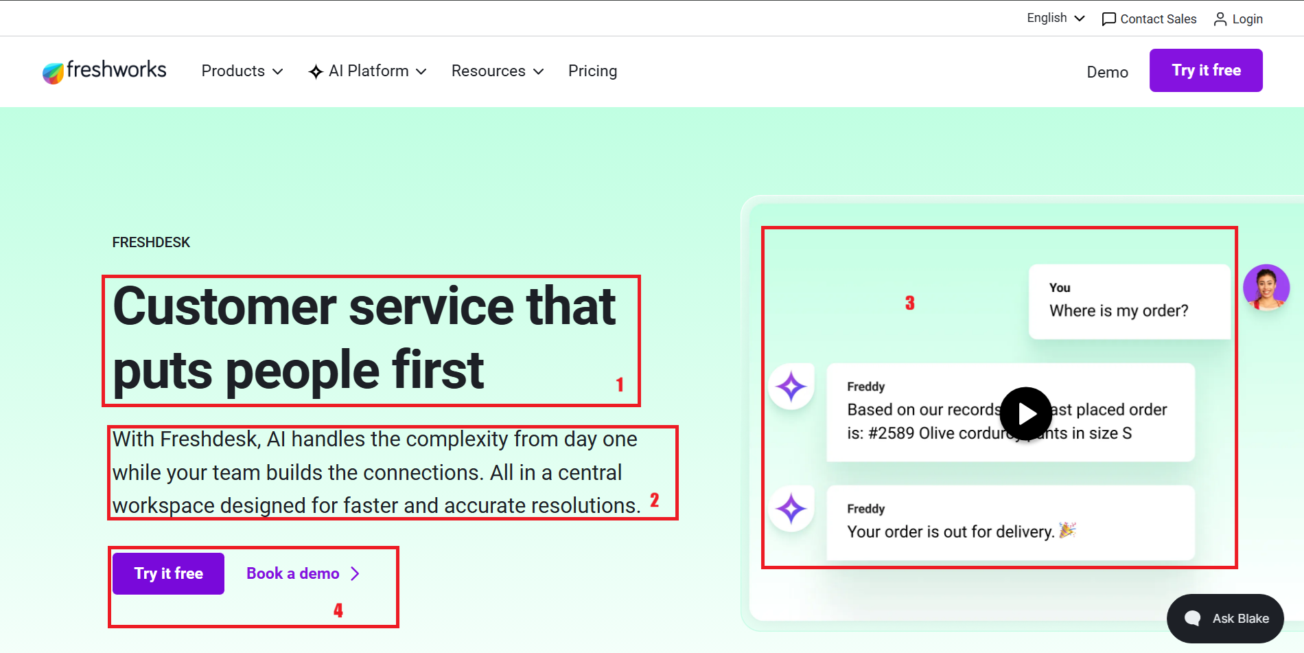
- 1. Brand-led, not outcome-led. Tells visitors what Freshdesk values, not what it delivers.
- 2. Introduces 'Freddy' and 'central workspace' — product features without context of what they prevent or enable.
- 3. B2C query in a B2B product's hero section. Creates an immediate context mismatch for support team evaluators.
- 4. No social proof visible above the fold. 74,000+ businesses claim and customer logos are only seen by visitors who scroll.
The product explains what it does but not what it changes for the team using it
2.1 — Feature descriptions are not connected to team outcomes
Finding
The homepage capability section lists features including omnichannel support, advanced ticketing, Freddy AI Agent, Freddy AI Copilot, self-service, and collaboration tools. Each feature is described in terms of what it does "Resolve complex, repetitive queries", "Help agents work smarter with AI summaries", but stops short of explaining what this means for the team's day-to-day experience or the business outcome it produces.
Screenshot annotation — Capabilities section
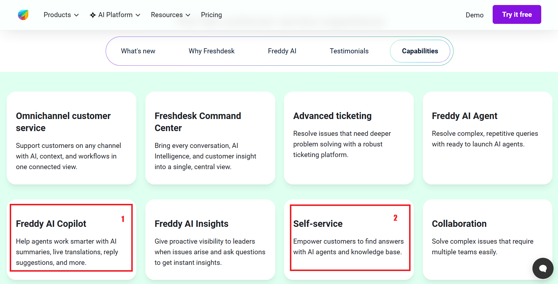
- 1. 'Help agents work smarter' describes the mechanism. What does smarter look like? Fewer escalations? Faster response times? Agents going home on time?
- 2. Empowering customers to find answers — but what does this mean for the team? How many tickets does it prevent?
Impact
A support manager evaluating this product needs to justify the decision internally to a founder, a finance lead, or a team. Feature descriptions do not give them the language to do this. Outcome-led messaging ("Reduce first response time by X", "Handle 30% more queries without adding headcount") gives them a business case. Feature-led messaging gives them a spec sheet.
Recommendation
2.2 — The Freshdesk vs Freshdesk Omni distinction is never explained
Finding
A visitor signs up for Freshdesk. After completing the signup form and a personalisation questionnaire, they land inside a product called "Freshdesk Omni." No explanation is provided at any point — on the homepage, in the signup flow, or on the first screen inside the product about what Freshdesk Omni is, how it differs from Freshdesk, or why the product they signed up for and the product they are now using have different names.
Screenshot annotation — Post-signup personalisation screen
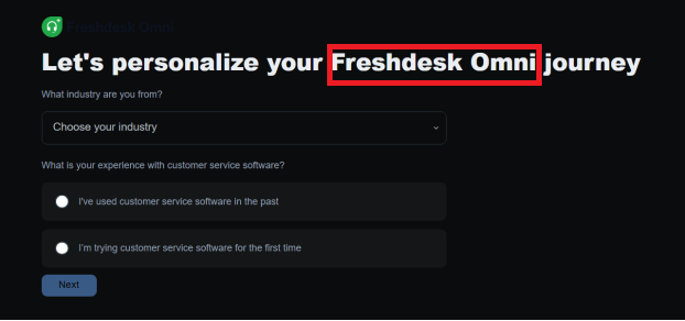
- First mention of 'Omni.' The visitor signed up for Freshdesk. No explanation of what changed or why.
Impact
Naming confusion at the point of first entry into the product creates immediate distrust. A new user who expected Freshdesk and finds themselves inside something called Freshdesk Omni may assume they signed up for the wrong product, that they are on a different pricing tier than expected, or that the product is more complex than they anticipated. Any of these assumptions increases the likelihood of abandonment before first value is reached.
Recommendation
2.3 — Homepage promises are not fulfilled by the trial experience
Finding
The bottom of the homepage includes the claim: "Free to try. Fast to scale. Experience the power of Freshdesk with a free trial. No credit card needed. Set up in minutes and see immediate value." The actual trial experience requires completing a six-field signup form, answering a personalisation questionnaire, and navigating a three-step setup checklist before any meaningful interaction with the product is possible.
Screenshot annotation — Homepage bottom CTA section
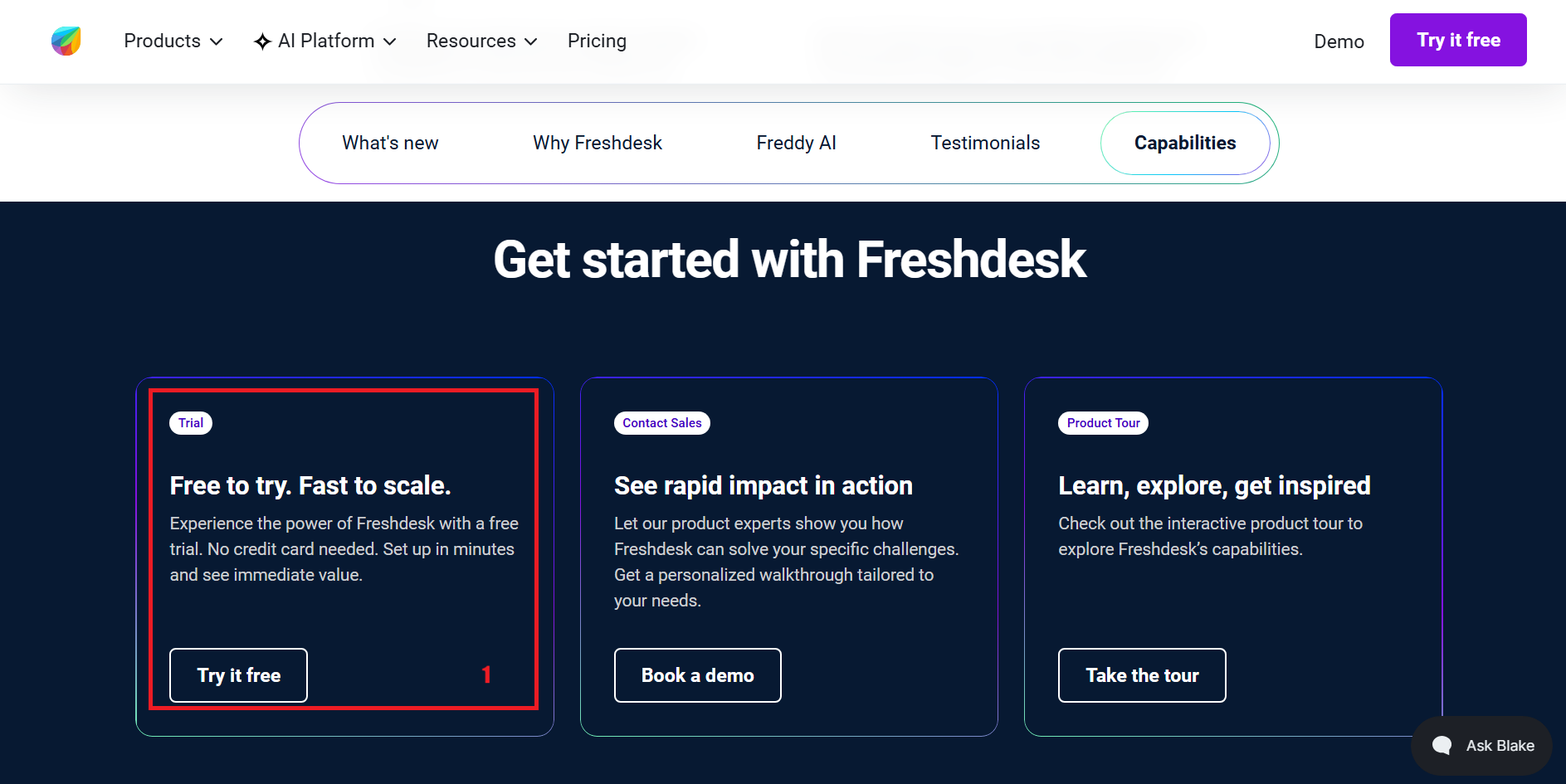
- 1. The promise of "Set up in minutes and see immediate value" is not fulfilled by the current trial experience. Actual path to first value requires form completion, questionnaire, and setup tasks.
Impact
When a product's marketing language sets an expectation that the product experience does not meet, it creates a specific kind of trust damage not confusion, but disappointment. A user who arrived expecting "set up in minutes" and encounters a setup checklist at step one will feel misled, even if the product itself is excellent. This gap between promise and reality is one of the most common causes of early trial abandonment.
Recommendation
Every step between intent and first value adds a reason to abandon
3.1 — The signup form asks for more than is needed to begin a trial
Finding
The signup form requires six fields: first name, last name, work email, company name, organisation size, and phone number. Organisation size is a required dropdown. Phone number, while technically optional, is present and visible. Two legal checkboxes are stacked immediately above the submit button. For a user arriving with self-serve intent "looking to explore the product independently" this form communicates complexity and sales follow-up before they have seen the product at all.
Screenshot annotation — Signup form
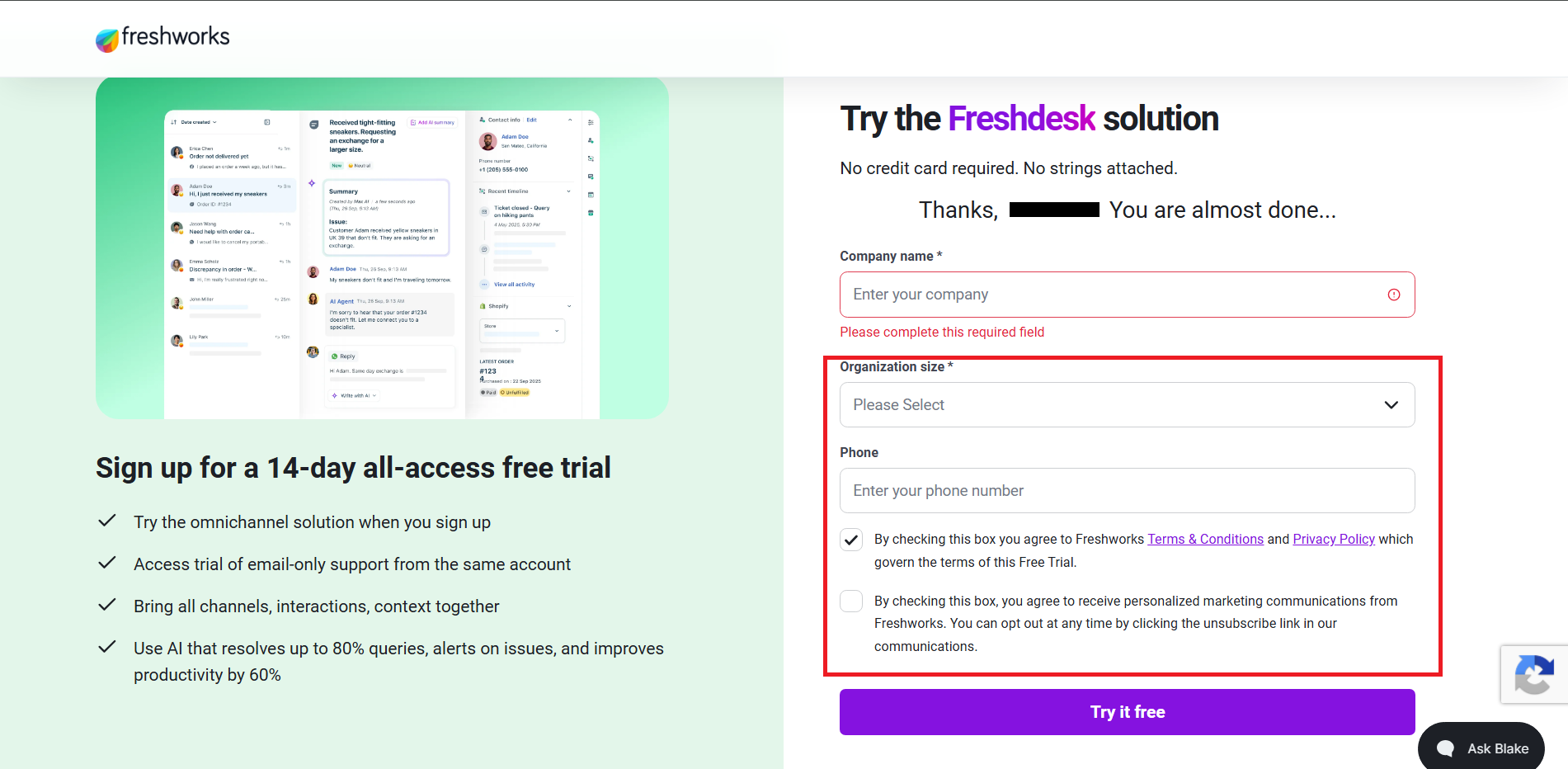
- Organisation size (required) serves Freshworks' sales segmentation, not the user's path to value. Can be collected after first meaningful product interaction.
- Phone number field optional but visible. Signals 'a salesperson will call you' to self-serve evaluators. Increases form abandonment among this segment.
- Two separate agreements stacked before the CTA. The marketing communications checkbox especially adds a decision the user did not come to make.
Impact
Each additional field in a signup form reduces the proportion of users who complete it. Required fields that serve the business rather than the user — organisation size, phone number are particularly damaging to self-serve conversion because they signal that the product is optimised for sales, not for the evaluator. Users who want to explore independently often abandon at forms that feel like lead qualification.
Recommendation
3.2 — A personalisation questionnaire interrupts the path to the product
Finding
After completing the signup form, new users encounter a full-screen questionnaire: "Let's personalise your Freshdesk Omni journey." The questions ask for industry and prior experience with customer service software. The screen is presented as personalisation for the user's benefit, but the information collected is more likely used for internal segmentation and sales routing than to meaningfully alter the trial experience.
Screenshot annotation — Personalisation questionnaire
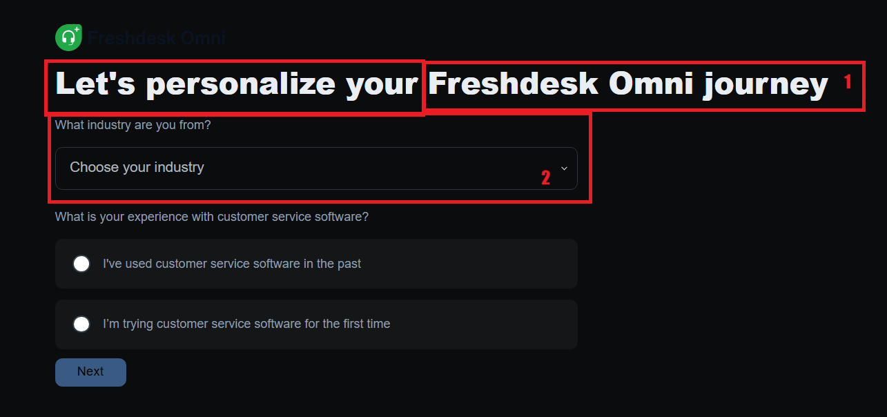
- 1. Framed as personalisation for the user. Positioned between signup and product access — adds a step without demonstrably changing what the user experiences inside the product.
- 2. Industry drop-down is segmentation data for Freshworks. Does the onboarding experience actually change based on this answer? If not, this question should be removed from the pre-product path.
Impact
Every screen between signup and first product access is an opportunity for the user to reconsider. A questionnaire that feels like it serves the business rather than the user particularly one that appears immediately after an already lengthy signup form compounds the friction already accumulated. Users with low commitment drop off here. Users with high commitment continue but arrive at the product already slightly frustrated.
Recommendation
3.3 — The first screen inside the product leads with setup, not experience
Finding
The first screen a new user lands on after completing signup and the questionnaire is a "Quick start" checklist: "Get your support desk ready." Three tasks are presented - Connect your support channels, Explore your Inbox, and Invite your team with a 0/3 progress counter. The primary action highlighted is "Connect" requiring the user to integrate an external support channel before they can meaningfully interact with the product. "Invite your team" as a step assumes the user has a team available to invite on day one of their trial.
Screenshot annotation — Quick start screen
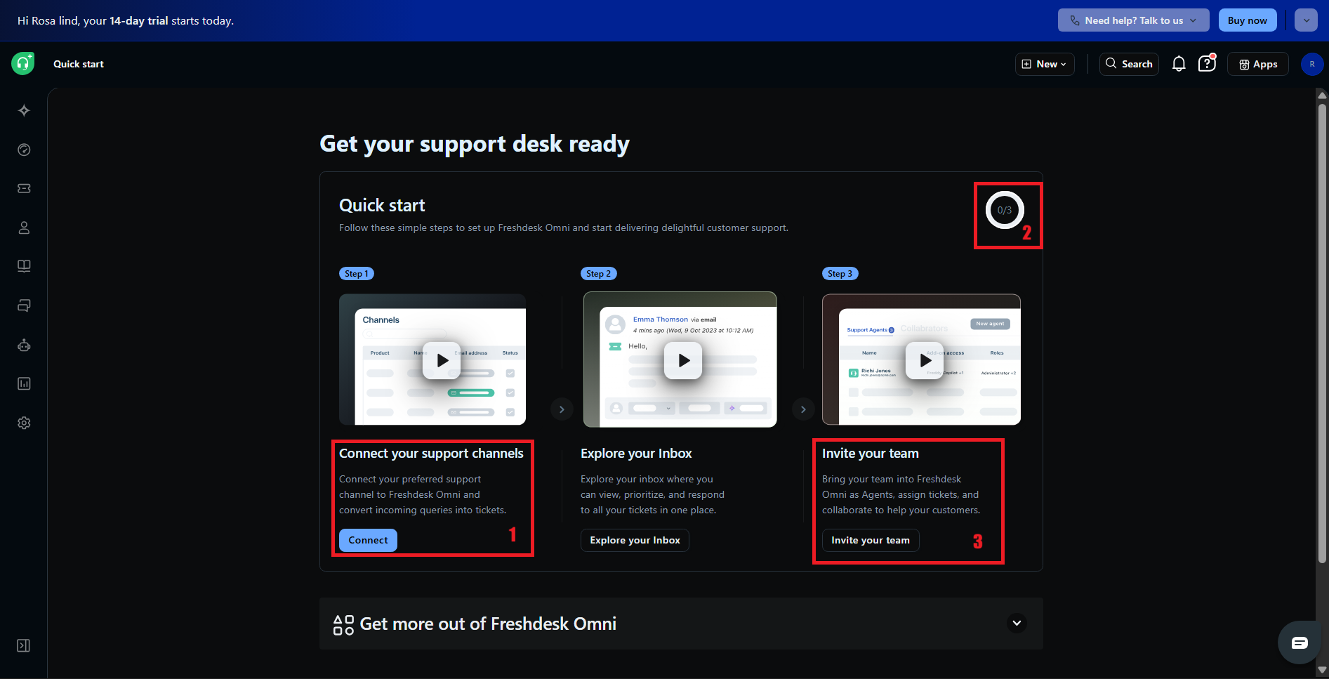
- 1. First required action asks for an integration before the user has experienced a single ticket. Commitment before value.
- 2. New user has completed nothing. The counter opens at zero communicating 'you haven't started yet' rather than 'you're already here.'
- 3. Assumes team availability on day one. A solo founder or a single evaluator has no one to invite making the checklist immediately feel incomplete.
Impact
A setup checklist as the first screen communicates that the product requires work before it delivers value. Users who signed up to evaluate whether Freshdesk is right for them are immediately redirected toward configuration tasks. Those with low to moderate intent the majority of trial signups are likely to close the tab rather than connect a support channel they haven't decided to route through Freshdesk yet.
Recommendation
The product shows a working environment but doesn't guide the user to experience it
4.1 — Sample data is present but not connected to a meaningful first action
Finding
The dashboard and ticket inbox are pre-populated with sample data three tickets with realistic names, priorities, and statuses, and a populated dashboard with ticket metrics and trend graphs. This is a meaningful design decision that avoids a fully empty workspace. However, the sample data is visibly fictional (customer names like "Emily Garcia" and "Bob Tree from Freshworks", company "Acme Inc") and no guidance is provided on what to do with it. There is no prompt to open a ticket, resolve a query, or experience what the product feels like to use.
Screenshot annotation — Ticket inbox
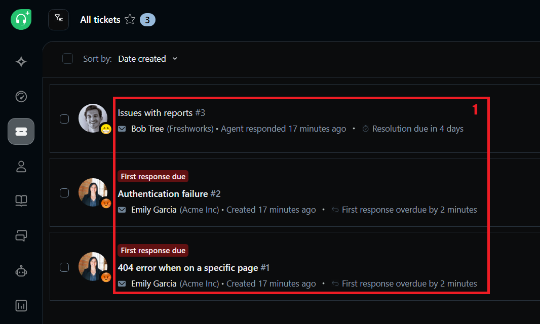
- Sample data present avoids empty workspace. But no instruction, prompt, or guided action tells the user what to do next. The data is there; the experience of using it is not facilitated.
- Fictional and immediately recognisable as such. Users cannot project themselves into this context. Sample data that mirrors real B2B support scenarios would be more effective.
Impact
Sample data without guided interaction does not produce the "aha moment" the point at which a user understands what the product can do for them specifically. A user who opens the inbox, sees three fictional tickets, and receives no prompt about what to do next will explore aimlessly or not at all. The product has done the work of populating the environment but has not completed the job of delivering value within it.
Recommendation
4.2 — The product signals complexity before the user is ready to receive it
Finding
Below the Quick start checklist, a collapsed section titled "Get more out of Freshdesk Omni" contains an extensive secondary setup list: Business Hours configuration, SLA Policies, Canned Responses, Ticket Fields, third-party integrations, self-service setup, agent management, and Freddy AI configuration. This section is visible on the first screen, during the first session, before the user has completed a single meaningful action in the product. Separately, a webinar popup appears offering hands-on setup training "Basics of ticketing and self-service", "Advanced ticketing and automation" implying that the product requires formal training to use effectively.
Screenshot annotation — "Get more out of Freshdesk Omni" section
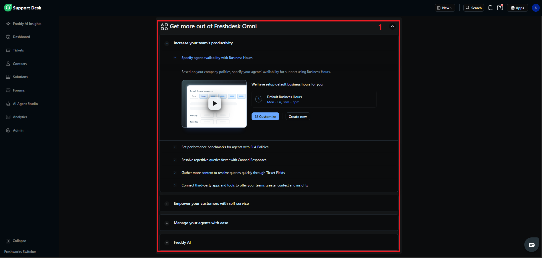
- Eight categories of configuration presented to a user who hasn't resolved their first ticket. The breadth of this list signals 'this product is complex' before the user has experienced any of its value.
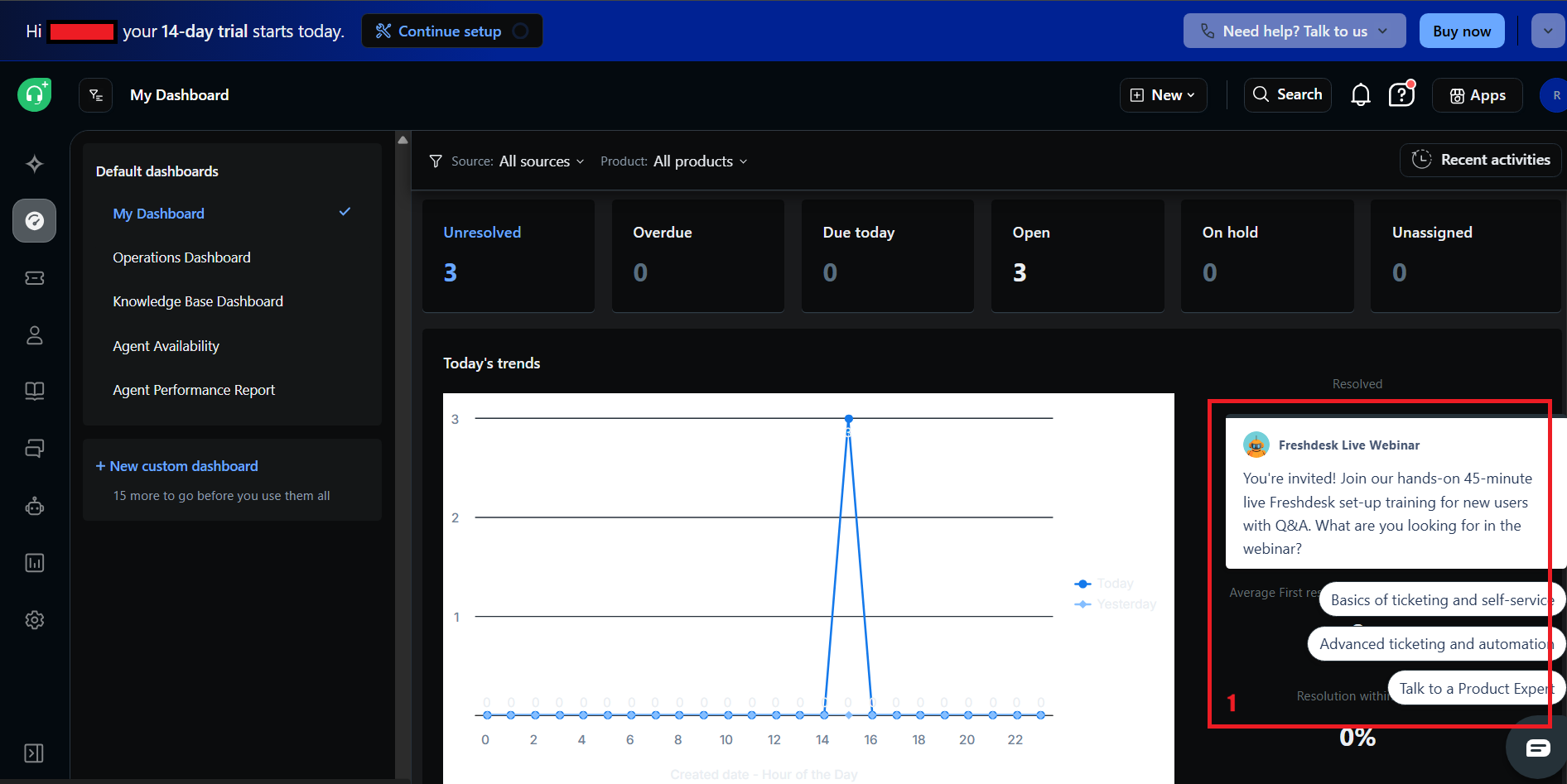
- A live training offer on day one signals that independent discovery is not the expected path. This is a support mechanism for a friction problem, not a solution to it.
Impact
Cognitive overload at first entry is one of the most reliable predictors of trial abandonment. When a user's first impression of a product is the volume of configuration it requires, they calibrate their expectation of time-to-value upward significantly. Users who arrived expecting to evaluate a support tool in 20 minutes now believe they are looking at a multi-day implementation project. Most will not begin.
Recommendation
Priority Fix Roadmap
Fix First
Fix Next
Fix Later
Findings Summary
| Gap Category | Finding | Impact |
|---|---|---|
| Trust Gap | Brand-led headline, B2C hero visual, social proof below the fold | High |
| Messaging Issue | Features without outcomes, Freshdesk vs Omni confusion, broken promise on setup time | High |
| Friction Point | Oversized signup form, pre-product questionnaire, setup checklist as first screen | High |
| Value Gap | Sample data present but unguided, complexity signalled before value is experienced | Medium |